Table of Contents
- Introduction to Small Text in Embroidery
- Common Problems with Small Text in Embroidery
- Why Small Text Creates Issues
- Proven Solutions for Small Lettering
- Tips for Better Small Text Embroidery
- Advanced Tips: Tools and Testing Techniques
- Get Professional Digitizing Help
- Conclusion
Introduction to Small Text in Embroidery
Small text in embroidery often appears blurry, unreadable, or distorted after stitching. This happens because embroidery machines can only handle a certain stitch density and thread thickness. When letters are too small, the stitches overlap or disappear, making the text impossible to read. Understanding these limitations is the first step toward fixing them.
In embroidery, the term “micro text” refers to lettering below 5mm in height. Stitching this level of detail requires precision digitizing, accurate thread tension, and proper fabric selection. For best results, many professionals rely on expert digitizing services such as Quality Digitizing to ensure perfectly legible small text in embroidery.
Embroidery has evolved from ancient handcraft into a modern digital process. You can learn more about this fascinating art and its history at Wikipedia’s embroidery article, which explains how stitching methods have developed over centuries and how technology has transformed the craft into a precise, machine-driven art form.
Common Problems with Small Text in Embroidery
Let’s explore the typical challenges faced when working with small lettering in embroidery. Even seasoned embroiderers often struggle with legibility, consistency, and smoothness when working below 5mm font height.
1. Blurred or Overlapping Letters
Overly dense stitches cause threads to overlap, making the text blurry or unreadable. This usually occurs when the font size is too small for the fabric and thread type used. The key is balancing stitch count and density.
2. Missing Stitches
Very fine details often don’t appear at all because the needle cannot execute such tight movements. Missing stitches result in incomplete or broken text that ruins the clarity of small designs.
3. Uneven Text Alignment
Fabric stretching or excessive machine vibration can cause misalignment, making letters look crooked or inconsistent in height. Proper stabilization and tension are crucial for clean lettering.
4. Fabric Puckering
Too many stitches in a small area create tension, which pulls the fabric together and forms wrinkles, ruining the overall appearance of the embroidery. A balanced underlay and stable fabric prevent puckering.
5. Thread Fraying or Breaking
When using dense or tiny fonts, friction and repeated needle penetration can damage threads. Using lubricated, high-quality embroidery thread such as Madeira’s polyester thread range can help maintain durability and sheen.
Why Small Text Creates Issues
Embroidery machines interpret artwork in stitches, not pixels. Each stitch has a physical length and thickness. When letters are too small, there’s simply not enough room to represent all the fine details. As a result, the final output loses definition.
Another major cause of poor small text embroidery is improper digitizing. The wrong stitch type, incorrect density, or missing underlay can make even simple designs look unprofessional. Skilled digitizers understand that letters need spacing, shortened stitches, and optimized stitch angles to retain legibility at small scales.
Machine calibration also plays a big role. Poor hoop tension or misaligned thread paths can cause distortion. To better understand how stitch data translates into embroidery, see Embroidery.com’s guide on stitch density — an excellent resource for balancing stitch length, density, and clarity.
Proven Solutions for Small Lettering
Here are some professional methods to improve the quality of small text embroidery. Applying these steps can turn even the most challenging micro fonts into crisp, readable lettering.
1. Choose the Right Font
Use bold, block-style, or sans-serif fonts. Avoid thin or cursive fonts, which lose clarity at small sizes. Simple fonts like Arial, Helvetica, or Microblock are embroidery-friendly and yield sharper results.
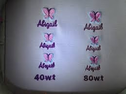
2. Increase Text Size
Whenever possible, keep lettering above 5mm tall. If you must go smaller, use thinner thread and smaller needles to maintain definition. Some digitizers even go down to 3mm using 60wt thread, but this requires exceptional precision.
3. Adjust Stitch Density
Reducing stitch density helps prevent thread buildup. Proper density ensures that stitches lie smoothly without merging together. Use shorter stitch lengths (0.8–1.0mm) to preserve sharp corners and edges.
4. Apply the Correct Underlay
Underlay stitches stabilize the fabric and prevent shifting. This foundational layer ensures crisp edges and consistent results even with small text. Try using center-walk or zig-zag underlays for the best stability.
5. Use Proper Thread and Needle
Lightweight thread (like 60wt) and a fine needle (size 65/9 or 70/10) work best for small details. This combination reduces distortion and enhances readability.
6. Select Stable Fabric
Smooth, tightly woven fabrics such as cotton twill, polyester blends, or poplin hold stitches better than textured materials like fleece or denim. The smoother the base, the cleaner the lettering.
Tips for Better Small Text Embroidery
- Preview your design in embroidery software before production.
- Use stabilizers to minimize fabric movement during stitching.
- Test on sample fabric before final embroidery to detect density or tension issues.
- Maintain consistent text size and spacing throughout the design.
- Avoid auto-digitizing tools for detailed logos—manual digitizing yields superior accuracy.
- Use software with a realistic stitch preview, such as Wilcom EmbroideryStudio, to spot and fix small-text issues before production.
Advanced Tips: Tools and Testing Techniques
When dealing with small text, testing and adjustments are crucial. Always perform a test run using the same thread, fabric, and stabilizer intended for final production. Document the settings — thread tension, density, and needle size — for consistency across future runs.
Calibrate your machine regularly to prevent uneven stitches. For color precision and thread management, reference professional color systems such as Pantone’s Color Bridge to match digital artwork with actual thread shades. Additionally, explore embroidery forums and communities like Embroidery.com’s blog for troubleshooting real-world examples of micro text stitching.
Get Professional Digitizing Help
Small text requires expert attention to detail. If your embroidery designs suffer from unclear or distorted letters, a skilled digitizer can fix the problem. Quality Digitizing offers fast, affordable, and precise digitizing services designed for perfect results across all fabric types. Upload your file and receive a production-ready embroidery design in hours, customized for your exact machine format.
Conclusion
Small text in embroidery can be tricky, but with the right techniques, materials, and digitizing approach, you can achieve clear, professional results. Avoid overly small fonts or dense stitch patterns, and always test your designs before production. The combination of proper digitizing, high-quality thread, and stable fabric ensures readable, sharp, and balanced lettering.
When in doubt, trust professionals who understand embroidery’s technical side and can convert your artwork into flawless stitch files. For clean, precise lettering that enhances your brand identity, visit Quality Digitizing today and experience the difference expert digitizing can make in every stitch.